Key Takeaways
- Color Matching is Essential: The right tile color can transform a pool area, enhancing aesthetics and creating a relaxing environment that resonates with personal style.
- Consider Water Color: The type of tile affects how water appears; lighter tiles create a bright feel while darker tones promote a tranquil ambiance.
- Assess Surroundings: Evaluate existing features, lighting, and outdoor elements when selecting tiles to ensure a cohesive look and harmonious atmosphere.
- Use Color Theory: Understand primary, secondary, and tertiary colors to select tiles that evoke desired feelings and complement the overall pool design.
- Experiment with Samples: Utilize color swatches and online tools to visualize tile combinations in real settings, observing how colors change with different lighting conditions.
- Explore Trends and Combinations: Stay informed about popular color schemes and innovative combinations to keep your pool area fresh and stylish, reflecting your unique taste.
When it comes to transforming our pool area, choosing the right tile color can make all the difference. Did you know that 70% of homeowners report feeling happier and more relaxed in spaces that reflect their personal style? The right tile not only enhances aesthetics but also complements the overall design of our outdoor oasis.
Matching colors might seem daunting, but it’s all about understanding the interplay between water, light, and surrounding elements. Whether we’re replacing old tiles or adding new ones, we can create a cohesive look that elevates our pool's appeal. Let’s dive into some essential tips and tricks that’ll help us make informed choices and achieve a stunning result.
Importance of Color Matching in Pool Design
Color matching plays a critical role in pool design. The right tile color doesn't just beautify; it transforms the entire space. A well-chosen color scheme enhances aesthetics and creates a relaxing environment, making us feel right at home.
We all have that friend who painted their living room bright orange because they thought it would be "lively"—only to end up with a space that feels like a circus tent. Color in pool design has a similar impact. The wrong tile choice can make the area feel off or even overwhelming.
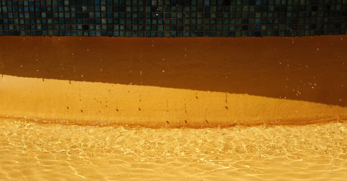
Consider water color. The type of tile affects how water appears. Light colors often make it look bright and inviting, while darker tones might create a deep, relaxing hue. We can utilize nature’s shades, aligning our color choices with the sky and surrounding flora. How can we incorporate these elements to create a harmonious setting?
Matching colors with our outdoor theme adds cohesion. Tile color impacts the ambiance. A pool that blends with natural surroundings exudes tranquility and encourages relaxation. Think about how we use earthy tones against lush greenery for a spa-like feel.
Challenges arise, especially under varying light conditions. Tiles can shift in appearance based on day time or artificial lighting. Observing tiles at different times of the day helps us see how colors interact with sunlight and shadow. Have we taken a moment to visualize our tiles in the real world?
Even the materials we choose can influence color perception. For instance, a glossy tile reflects light vividly, while a matte surface may absorb it, creating different moods. Understanding this interaction is crucial. How do we want our pool area to feel during different times of the day?
Incorporating surrounding elements is vital. Fencing, landscaping, and outdoor furniture all contribute to color cohesion. We should think beyond tiles; look at the entire space. A cohesive palette across various elements enhances our pool's visual impact.
As we choose tiles, let’s consider trends too. Various styles come and go, but timeless colors often prevail. Blues and greens remain popular for their association with water. What's our personal style? Do we lean toward traditional or contemporary looks?
Color matching creates community among us, as we discuss choices and share inspiration. We often trade stories about our experiences—like that time someone discovered their tile choice made the pool look like a giant avocado! Such tales remind us of the importance of thoughtful selection.
Color matching in pool design holds significance for aesthetics and ambiance crafting. Working alongside nature, understanding light, considering surrounding elements, and drawing from our personal experiences helps us choose wisely. Let’s embrace our creativity, discuss our ideas, and celebrate the beauty of our pool spaces together.
Understanding Tile Color Theory
Understanding tile color theory helps in selecting the best colors for a pool area. This influences not just aesthetics but also the overall ambiance of outdoor spaces.
Primary Colors
Primary colors—red, blue, and yellow—serve as the foundation for all other hues. In pool design, blue reigns supreme. Blue tiles create a refreshing feel, mirroring the water's natural appearance. Blue shades evoke calmness, making poolside relaxation more enjoyable. Yellow can add warmth, brightening up cooler tones, while red adds a bold statement.
Selecting primary colors sets the tone for the entire space. For example, a decision to use light blue tiles around the pool's edge can lead to a vibrant look, especially when complemented by sunny yellow umbrellas or lounge chairs. How do colors make you feel in your outdoor space? Do you lean toward calm blues or energizing yellows?
Secondary and Tertiary Colors
Secondary colors, formed by mixing primary colors, include green, orange, and purple. Green works well in pool areas because it resonates with nature, blending seamlessly with surrounding landscapes like gardens or lawns. Imagine lounging by a pool with green tiles reflecting lush shrubbery—it creates a connected, serene atmosphere.
Tertiary colors expand this palette further with shades like teal and olive. Choosing these colors introduces deeper layers of vibrancy. For instance, teal tiles can harmonize beautifully with white decking, giving a tropical vibe.
Mixing and matching these colors can lead to interesting outcomes. Have a favorite color combination in mind? Consider how different shades work together for added depth and appeal. Remember, your pool space should reflect your style while enhancing the overall experience.
Assessing Your Pool Environment
Assessing the pool environment is crucial before selecting new tiles. Different aspects, from existing features to lighting, can vastly alter color perception and affect the overall pool aesthetic.
Existing Features and Surroundings
Considering the existing features around the pool informs our tile choices. We should observe elements such as landscaping, decking, and outdoor furniture. If we have rich green plants or a warm wooden deck, lighter or warmer tile colors provide a great contrast, creating an inviting ambiance. Alternatively, a modern stone pathway might favor cooler tones, like soft blues or grays. Let’s think about our personal style. Does the area already lean toward a specific color palette? Matching tile colors to these features creates a seamless transition and enhances the overall look.
Lighting Conditions
Lighting conditions significantly impact how tile colors appear. Natural sunlight can shift hues from vibrant to muted as the day progresses. Early morning light often casts a cool tone, while late afternoon sun brings warmth. Standing in different spots around the pool at various times helps us visualize how colors truly look. Using this information allows us to pick tiles that maintain their appeal throughout the day. We also might consider using lighter tiles to reflect sunlight, creating a bright and cheerful environment. Asking ourselves how the color looks under various lighting can save time and frustration later. Have we considered night-time illumination effects? Color-changing lights can enhance a pool’s vibe, making it a perfect nighttime retreat.
Techniques for Color Matching Tiles
Color matching tiles requires thoughtful consideration and a few proven techniques. Let’s explore methods to achieve a harmonious look for pool areas.
Color Swatches and Samples
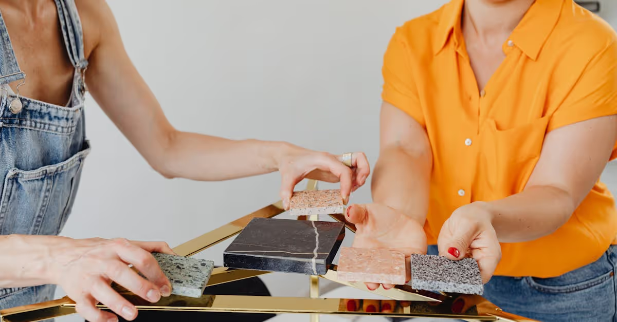
Working with color swatches and samples makes it easier to visualize tile combinations. We should gather samples of potential tiles from local suppliers. Most suppliers offer small swatches or even larger samples to take home. Placing these samples in the pool area helps us see how colors interact with the water, sunlight, and other surrounding features.
We can also observe how colors appear at different times of the day. For instance, a tile that looks vibrant in the morning sun may appear muted in the evening shadows. It’s pivotal to assess these variations. Bringing family or friends along can provide fresh perspectives on our choices, and it makes the experience enjoyable. Plus, it’s always fun to share opinions about colors—like deciding whether a new shade of blue is “ocean-like” or “smurf-tastic.”
Online Tools and Resources
Online tools and resources offer an excellent way to experiment with tile combinations before making decisions. Many websites have color visualization tools that allow us to upload an image of our pool area. Then, we can play around with different tile colors virtually.
Exploring Pinterest can provide inspiration, as it showcases countless pool renovations with various tile options. We can even find websites dedicated to pool design that offer guidance on color schemes and current trends. These resources make a great starting point for expressing our style.
As we navigate this colorful quest, let’s ask ourselves: What colors resonate with our personal tastes? Do we want a serene oasis or a vibrant party space? Each choice reflects our style and can transform the pool into a captivating retreat, one tile at a time.
Popular Tile Color Combinations
Choosing the right tile color combinations makes a significant difference in our pool areas. Let's explore some popular options that enhance the beauty and feel of our outdoor spaces.
Classic Pool Color Schemes
Classic color schemes typically revolve around shades of blue and white. Deep navy blue tiles combined with crisp white accents create a timeless nautical theme. This combination evokes images of serene ocean waves. Warm beige tiles alongside soft blue accent tiles mimic sandy beaches. Using these combinations brings a calm, relaxed vibe, inviting everyone to enjoy the pool.
Green tiles also blend well in a classic scheme, especially when paired with light tones. Think of rich emerald green accents contrasting with pastel yellows for a cozy garden feel. This approach connects our pools with nature, offering a tranquil escape perfect for summer gatherings.
Modern and Trendy Options
Modern color trends often play with bold and unexpected color pairings. Dark slate tiles juxtaposed against vibrant teal or turquoise accents create a striking contrast. This combination brings a contemporary feel, energizing the space and standing out against lush landscaping.
Mixing soft greys with bold colors is another trendy choice. Grey tiles provide a sleek backdrop while bright red or orange accents add excitement. This combo instantly modernizes the pool area and draws the eye, making it an attractive focal point.
We can also engage with textural contrasts, using matte tiles with glossy finishes. This blend not only enhances aesthetics but also adds depth. We need to consider the overall vibe we want to achieve, ensuring our tile choices reflect our personal style while making the pool area a welcoming oasis for all.
Conclusion
Choosing the right tile color for our pool area is a vital step in creating a beautiful and inviting space. By understanding the interplay of colors and their effects on light and water, we can make informed decisions that enhance our outdoor oasis.
Let’s embrace creativity and explore various combinations that reflect our personal style while harmonizing with the surrounding environment. Remember to consider the impact of natural light and how our chosen colors will look throughout the day.
With thoughtful selection and a bit of experimentation, we can transform our pool area into a serene retreat that brings joy and tranquility to our lives. Let’s dive into this colorful journey together and make our pool spaces truly shine.
Frequently Asked Questions
Why is tile color important for a pool area?
Tile color is crucial for a pool area as it enhances aesthetics and creates a relaxing environment. The right choice reflects your personal style and can significantly transform the space, making it more inviting.
How do colors affect the appearance of water in a pool?
Lighter tile colors create a bright and open feel, while darker colors provide a calming, deep hue. The chosen tile color interacts with water, influencing its visual appeal and overall ambiance.
What factors should I consider when choosing tile colors?
Consider existing features, landscaping, and lighting conditions. These elements can change how colors are perceived and create a cohesive look for your pool area.
How can I visualize tile combinations effectively?
Using color swatches and samples is recommended to see how colors interact. Observing tiles at different times of day helps in assessing their true impact in your outdoor space.
What are some popular tile color combinations for pools?
Classic schemes often feature shades of blue and white for a serene look. Modern trends include bold combinations, like dark slate with vibrant teal, incorporating textural contrasts for added aesthetics.


